Was the iPhone 5 event a let down?
Posted: September 13, 2012 Filed under: Random Talk, User Experience | Tags: Apple, iPhone, iTunes, Smartphone Leave a comment »As always, the world turned to California to check on what’s apple next offering on phones side, and also to check if there are any other upgrades to their current lineup of products and possibly the introductions of new ones.
The event in review: new iPhone, new iPods, no iPad Mini = few if any surprises. Did Apple disappoint? I don’t think so, but the iPhone 5 was heavily spoiled by the excessive leakage of the new phone parts, and that’s where most of the hype is focused on the Fall event, as always. Granted, much of the iPod news were cloudy, but except for the iPod Nano, which is the product that always changes the most, everything else was just predictable. The new iPod Touch is as expected, an iPhone 5 without the phone and few minor downgrades and featuring smaller and lighter design. Without a new product to show (bet the ones predicting the iPad Mini will move it to 2013), Apple’s event felt almost like if it wasn’t needed to begin with. Still most of them are great products, and that’s why is not a real let down, was just extremely predictable.
But let me make it clear, I don’t want to saturate the internet with even more repetition of the same information; you can check other sources for all the detailed information or even Apple’s site. What I want to do it’s a breakdown of the event and talk a bit about its products on the design and engineering perspective.
With that in mind, let’s begin!
iPhone 5
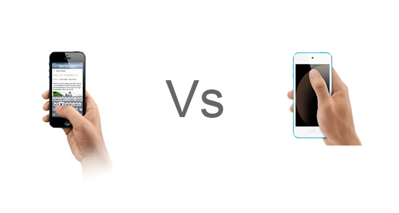
The new iPhone is bigger and small at the same time, a bit lighter and slimmer, but longer which accommodates to a new a bigger screen that is close to a standard widescreen ratio which must be amazing for consuming content. Some people criticized that Apple didn’t do a bigger screen all around and their answer had to do with ergonomics. Supposedly the width of the iPhone 5 is not bigger because it fits better in your hand, and I can surely bet that it has to do with the thumb, the finger that let us text messages and interact with different apps singlehandedly needs to reach to every part of the screen to support full interactivity with one hand. Assuming that Apple did their research they had the perfect size before, but why now add the extra height there? So the old screen had the wrong size all together or the new screen is wrong?
Here’s a video to illustrate my point:
If they designed the phone thinking about the standard human hand, I should be able to comfortably reach the top of my current iPhone screen, but if is higher I would rather slip my hand, and that’s what they do on the pics that shows how the thumb actually covers the whole screen, but again you will have to move your hand and that’s an extra step.
In the end I think is not that much about the thumb since software can be designed with that in mind, but about the hand, so in terms of making it bigger, longer was the way to go.
I actually like the new connector, the old one had almost a decade and was unnecessarily big, plus offering an adaptor at least brings an option to the consumer, but ads a lot of confusion to the product compatibility with accessories and other first and third party equipment. A new connector after a whole decade it’s ok, and I trust Apple will do the migration as painless as it can be without getting into the horrible port confusion that plagues some electronics, e.g. the display ports on the PC. In any case, by watching the advances in wireless technology we might not even need a connector in the future other than to charge it (until wireless electricity is viable).
There seem to be few changes in the back camera but a much needed upgrade on the front one, highly positive now that Facetime is going wild, and judging on how much people love to video blog or take portrait pictures, this will be just awesome.
iPods
First and foremost, what’s the deal with the strap on the new Touch? I don’t like the idea at all, iPods are products that you want to sit next to you on the bed or a sofa, sit in your pocket happily, is just changing of postions constantly and is not glued to your hand. Yes, the strap can make it more secure, but it severely limits the experience if your wear it all the time, plus, is going to tangle up with your earphones for sure. Weird idea that probably came from demographic research, but I’m not quite convinced. Other than that, the touch had is well needed refresh.
The Nano basically ignored pretty much that the 6th generation existed and went back to an evolution of the 5th, not a bad thing to do since the previous nano was more like a glorified shuffle. What I don’t quite get is why they made the design not consistent with iOS, the icons are now rounded and the home button too. Why they want to differentiate it? I assume they want to tell the user that, although this works in a similar way to iOS, is not a fully feature operative system, making it much like a focused toy, not a bad thing if the people that are being targeted wants something simple.
And the Shuffle? let’s not even start. No refresh at all, not even higher space or cheaper price, just new colors. Apple, you better had a new redesigned shuffle next year to make up for this. Definitely the biggest disappointment of the event. The reason for that is that I consider the shuffle the epitome of the simplicity and that is just about music, I love it! To think it doesn’t deserve a redesign is like saying they have a perfect product, which is never true. It can also be that they will slowly move it from the spotlight, like they did with the iPod Classic which also deserves a refresh. The iPod Classic is the only portable player with a humongous size for the person that wants to take everything with them, Apple can even evolve it to be a hub for your other iDevices so they can stream data from it.
iTunes
Finally, the refresh of the new iTunes is more than welcome. While there’s cero progress on the individual songs view, pretty much everything else is now better, and I personally love the “up next” feature, something that I was wishing for a very long time. Hopefully they translate that too to the Music Player on iOS.
Conclusion
Of course, until I haven’t tried these products I can confirm some of what I have written here. Still I wanted to state some of my hypothesis. Eventually I’ll have in my hand some of these devices and I’ll be able to tell if my early judging was correct. Is very exciting to think how some of the thinking behind these products is made since it has to appeal to so many people at the same time, and that’s why still with some of the minor problems stated here I think the event was good enough and delivered pretty cool new products to the market.
Designing a Web Portfolio – Part 1
Posted: August 2, 2012 Filed under: Human and Computer Interaction, User Experience, User Interface | Tags: HCI, IxD, UX, Web Leave a comment »Recently a friend of mine asked me to help him designing his online portfolio. He’s an Illustrator and he would like to project himself to the videogame industry as a concept artist.
Naturally a portfolio page is all about your work and how you share your ideas. The main audience is employers and people of the same business, or future co-workers. Is easy to discern that the main thing to be highlighted in the web page is the art work, easily accessible and presenting only the most significant items. Also, make very clear what the contact information is.
If I had the resources I would like to have some empirical data on how recruiters surf the web, but I can surely bet that their informavore behavior is: finding work samples as fast as possible to see if some of them will correspond to what their company needs at the moment.
So for starters, I did some research on some concept artist/illustrators portfolios. There are some good pieces out there, but not in terms of user centered design. Some of them featured a site built around the style of the artist, but they are not that easy to navigate. That is not an awful idea by any means if you want to produce an experience that is more akin to a journey, but we all know that is not what employers are necessary looking for, they want to see the material without any obstacles. In that sense, sites like this do a better work, and they are not very elaborate. This doesn’t mean that we can’t do anything fancy without having a hard to navigate page. There are many examples that do a wonderful work, making the art work the central piece of the design, straight to the point.
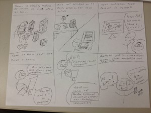
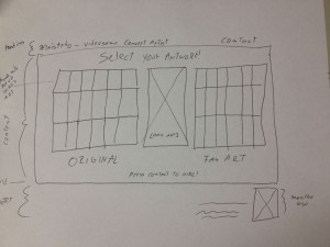
Just to know that we are on the same page as my client, I send him some storyboards, here is one of them:
The storyboard revolved around the idea that recruiters won’t take much time in a portfolio page, and that they wanted to see easily accessible work samples to see if the artists fit their need.
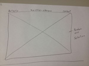
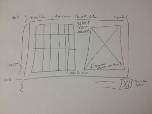
Several designs were proposed, so let’s check some of the main iterations. These are not wireframes but concepts bounded by necessary constrains, hence details like “fold” appear here to express that at least all the information presented above the fold must stay there for final specifications.
The first ones featured main sliding images with navigation menus on top or even hovering on the bottom of the image itself. Not necessarily innovative but they do a good job in letting know right the away the quality and style of the artist and fast access to a fairly straight portfolio. I tended to lean for the top menu one, to let the user know right away where they were sitting on and what they can do, nonetheless I was dissatisfied with the lack of interesting information architecture, simply many sites follow this archetypes.
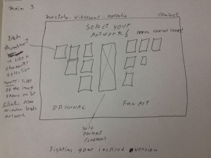
Some of the iterations produced this interesting design inspired on the character selection screen found on videogame fighting games. I thought that if I could somehow make this efficient enough I could not only give the user fast access to all the portfolio material, but be more profound in this videogame concept artist focus that was attempted to achieve with the design. Identification on top, thumbs that show each artwork with the correct affordances to click and dig in into the high resolution presentation of the material, and plus, as with fighting games, a preview of the full artwork on the right for fast non-modular checking, not just bigger thumbs, but the whole thing. Pieces where falling into the right places.
Few iterations later I decided to eliminate the separation between original artwork and fan art, since a concept artist is needed most of the time to create new characters. Still the necessary links to that kind of material will be provided.
Moving on to prototypes, I started building HTML/CSS based on Blueprint, first time I try it, already love it. Previously I used 960gs for this kind of rapid web prototype, but lately I’ve been hearing a lot about this framework and I decided to give it a try. Blueprint is basically the same concept but a bit more flexible.
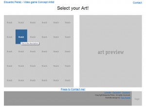
I made the thumbs change color when they are hovered to convey the appropriate interaction affordance, and when clicked a modal Ajax window will pop up with the full high resolution image. I tried a new jQuery plug-in on this project for this window called prettyPhoto and it worked pretty well so far, testing will tell if I stick to it.
The result is shown here:
The project is moving pretty quick, no we are working with the visual design and then some testing will be done for sure before putting it up.
Till then!.
iTunes needs better previews
Posted: July 30, 2012 Filed under: User Experience | Tags: Apple, Fix, iTunes, Music Leave a comment »A person stands in its computer browsing for new songs to listen, she happens to open iTunes and checks her favorite artist. Their last album had one of the best singles ever and she’s curious on what’s in store on the rest of the album, and is good to know that she will be using 30 seconds previews of the songs to make her next purchase decisions. The problem is that any of the song feel right, they’re not “that good”. What about the song that she heard at the radio or at a friend’s house? its supposed to be on this, their newest album but still, can’t find it anywhere.
This might have occurred to you, but although previews are an awesome feature they require author control. Like promotional video, the cover of the album or even the shows, the artist executes a certain control on the whole process to archive what is desired in terms of entertainment or even art. None the less, previews on iTunes are either created automatically or by some people behind the scenes, not the actual artist, so who decides what’s there? Who decides what’s the most important or identifiable part of a song?
Like movie trailers can make you decide if you are going to watch a movie, this previews do the same. It’s extremely important that this continues evolving, favoring the artist and indirectly, the consumer.
Simple solution for this Apple: let the artist select if they want iTunes to generate the preview for them or let them customize it to their liking. How? Let them input the portions of the song they want to use as preview. Of course there are many ways to do this, by manually putting time or by having and simple editor that lets the author select the portion in an interactive way and preview it before sending it, and even letting the artist upload pre-authored previews. Not only this solves the problem, but artist can plan in advance for this kind of previews while they are in the studio and record it in a proper way. An example of this would be that the artist creates a very simplified rehearsal of the song, or an edited portion that actually highlights the signature moments of it.
One minor complaint on the awesome experience that digital distribution provides us, and by keeping the artist happy they will provide better content and the final users will benefit from it, and of course, your company. We need to keep evolving!
Not quite what you expected – Condition ONE
Posted: January 5, 2012 Filed under: Human and Computer Interaction, User Experience | Tags: App, Immersion, iPad, Not quite what you expected 1 Comment »It’s extremely surprising how in this industry we find innovation almost daily. Anyone that tries to stay updated with everything that happens will tell you how hard it is to do it. But in the end there are a lot of solutions that are based in an idea that on its implementation it’s not quite what the concept was aiming for.
Most of ideas will begin in something like “wouldn’t it be cool if we do this” and then from it derivate to something more specific and possible, something like “wouldn’t it be cool if do this for this line of users on this age range, with this particular need and this certain times of the day”. And yes, they seem well structured, and the evaluation for the technology needed seems to be a good fit. But in the interactive world particularly the evaluation or development of the technology needed or the content itself fails often and products are rushed to the market as good ideas but poor execution.
Recently I was checking on the Condition ONE app on the App Store. It’s an app that basically immerses you in different scenes where different things happen, mostly documentaries about certain events, reports, etc. The way this works is that the app plays a video that is interactive in a way that you can move the device anywhere and basically change the perspective of the camera. Having the 360 degree power to look at the surroundings of the happenings, trying to emulate the feeling of being there.
Take a look at the video below and you will get a good representation on how the offering works:
Condition ONE Demo from Danfung Dennis on Vimeo.
Awesome right?, not quite. I was thrilled to try it but I was already expecting some hiccups on the road. The thing is most of this type of application rely on accelerometers or gyroscopes (or both) that checks constantly for the position of the device. Most of portable products nowadays use it perfectly for detecting screen orientation and it works alright. Some even use compass features and sometimes the sensors are that reliable that you can some pretty precise work. Also we have seen it countless times on pedometer apps and games.
Now if you want to use this for something like controlling a perspective it might not be perfect. To begin with you need a reference or a point to be the horizon, and then form there on move the perspective. Some Wii games, for example, will suggest you to point to the center of the screen before interacting with the camera or simple tell you to point to the center and recalibrate the camera with a button. This app does that with a button called center. I know what it does, but not any common user that used the app.
After that it gets really annoying is not well made for the experience. You don’t have control over focus or depths so some scenes are way too close to look properly at something interesting and you end up missing the whole point. Also it was filmed with shaking hands and that creates a lot of disorientation if your device is not moving at all or doesn’t feel like is responding properly. This is very important if the Condition ONE team attempts to create immersion because this particulars problems make the user seems like it doesn’t have the control over its actions.
But this is not an entirely a bad thing because from mistakes there’s learning and from learning there’s success. This errors can be fixed to adapt to the technology present on the iPad easily with a fixed design and a 1.5 release of this app that could be usable and not just something to toy with a couple of minutes and then not ever launch it again. The calibrating issue is workable by teaching the user how to use the app, and the video issue could be tweaked to be more stable and well thought. Some more controlled documentaries could help to experiment a little better with this before going to the field. Also, make it really worthwhile to see the whole spectrum of the scene, and when you focus on something give cues to the user so it redirects its attention there.
Condition ONE team, you’ve got something pretty cool here, don’t drop it, polish it and make it shine!. Also, this would be so cool in a CAVE like environment!.
Pushing the wrong buttons
Posted: November 5, 2011 Filed under: User Experience, User Interface | Tags: Industrial Design, User Interface Leave a comment »Sometimes it’s amazing how a lot of stuff it’s made without even thinking in the people that it’s using it. I’ve seen this problem in many things, not only Computers.
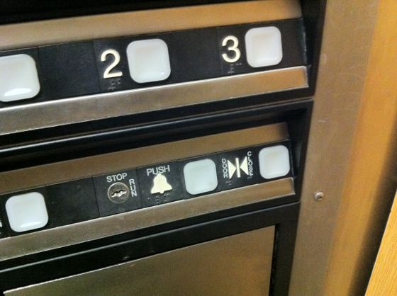
This past Friday I was using an elevator and had this interface, pretty common right?
Well there are several things that we can do to make a better panel, but let me focus on one thing here that is pretty common sense. The close button it’s there and its function is to close the door before the pre-programmed delay that the elevator doors have, usually this is used when you are in a rush and there’s no more people boarding the elevator in a way save some time. Next to it is the Alarm button, used for signaling an emergency, like if you got trapped in the elevator because of malfunctioning.
The alarm button should never be pushed if there’s no problem at all, first usually it triggers a very loud alarm that can confuse or even freak out people in the building, but it also might be an unnecessary waste the time for people in charge of the emergencies to come and check for a fake alarm. And there it is, just sitting to the side of a button that is used when you are in a rush or simply don’t want to wait, an stressful situation that increase probability of error.
How much time will pass before anyone pushes the wrong button? Not much of course.
Not only that, check the close button icon. Two arrows that can be interpreted as coming from the buttons between them, in other words, people can get confused if the arrows are just implying an action that the elevator does or they are coming from the buttons between them which may indicate their function. This will require you to use more cognition in order to get it, something we don’t usually do in a rush. What about blind people? They actually separate the Braille code in that particular icon implying that the left button might be a choice.
This could be remediated by keeping the panel consistent in its spacing, and while it does a good job by maintaining the buttons to the right of their respective label, it’s amazing how little details like this can actually create big problems in the user interface.
Cell phones + Kinect = Good idea?
Posted: November 1, 2011 Filed under: Human and Computer Interaction, User Experience, User Interface | Tags: Concept, iPhone, Kinect, Motion Sensing, Natural User Interface, Smartphone, User Interface 2 Comments »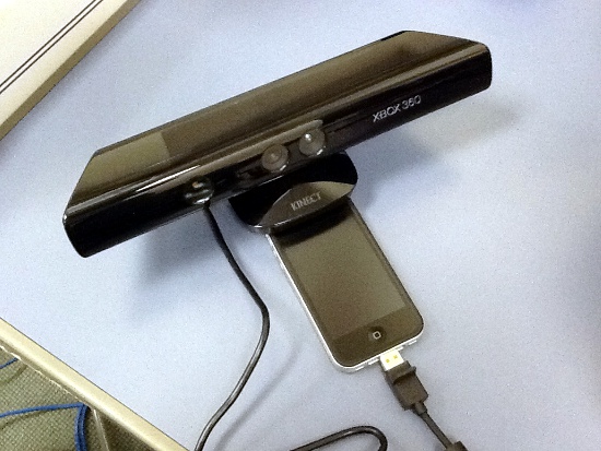
So yesterday I found a video about how technology like “Kinect” is reaching the cell phone market. Pantech is realizing a phone with this technology in Korea around November. Video of the commercial below:
First impression, pretty neat. Now let’s disassemble this idea.
In a practical sense there’s some stuff that are not being apparent here. When some it’s calling you could pick up a call easily by using a gesture as the ad shows, but when you are the one that wants to initiate a call it won’t work. Cell phones usually will turn off all their sensors when they are locked to save battery, there’s simply no way to keep the camera on for every time we want to perform a task with our phones, and as I said, this won’t be a problem for picking up a call since the phone it’s already awake when it rings, but when it’s locked or sleeping the phone is not listening to you all the time. Think of it as if you could use Siri in the iPhone 4S without touching the button.
But there’s definitive practical use for this, and might add it’s really a cool idea to add this functionality. Although have a camera that actively checking for hand gestures might be a real battery drain, there might be a way to build a decent camera that performs well the task without killing your battery every time you are using your phone.
My main problem with the video it’s the lack of vision and innovation. By reproducing gestures that already work well with touch you are just creating a gimmick, a device that it’s just for show off and adds very little to none to its purpose. Swiping photos by hovering your hand across the device doesn’t make it better, it’s just cooler, a factor that wears off in a week or less, and can actually get the user angry when the battery life will be inevitably shorter, they either introduce an great advancement in energy management or the phone will be pretty bulky.
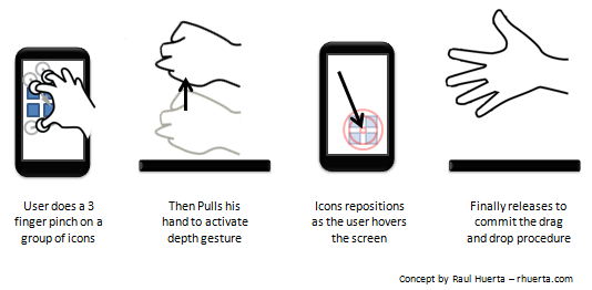
Still the idea it’s awesome, but it must be justified with great implementations, like upgrading current touching gestures or by creating useful gestures that can’t be done with current touch devices. A nice example will be to use a depth sensor to check how close or far the hand it’s from the device and make the GUI react to it as a function of those changes. For drag and dropping this could be perfect, imagine you could pinch into several objects to group them, then raise your hand, scroll around the GUI and the drop them whenever you like. This kind of example could be really uncomfortable to do on an “only touch” based device and a visual recognition approach could be useful.
That was just one example on what you could do with this kind of devices. Another would be to replace a lot of the 3D gestures that usually needs of an anchor, in other words, the use of two hands.
Of course, such a device would have to be planned well in all levels to achieve an integral solution, but I think feasible to create as a mass product in the near future. It’s a good idea but I don’t think the product shown in the ad will popularize it.
