Designing a Web Portfolio – Part 1
Posted: August 2, 2012 Filed under: Human and Computer Interaction, User Experience, User Interface | Tags: HCI, IxD, UX, Web Leave a comment »Recently a friend of mine asked me to help him designing his online portfolio. He’s an Illustrator and he would like to project himself to the videogame industry as a concept artist.
Naturally a portfolio page is all about your work and how you share your ideas. The main audience is employers and people of the same business, or future co-workers. Is easy to discern that the main thing to be highlighted in the web page is the art work, easily accessible and presenting only the most significant items. Also, make very clear what the contact information is.
If I had the resources I would like to have some empirical data on how recruiters surf the web, but I can surely bet that their informavore behavior is: finding work samples as fast as possible to see if some of them will correspond to what their company needs at the moment.
So for starters, I did some research on some concept artist/illustrators portfolios. There are some good pieces out there, but not in terms of user centered design. Some of them featured a site built around the style of the artist, but they are not that easy to navigate. That is not an awful idea by any means if you want to produce an experience that is more akin to a journey, but we all know that is not what employers are necessary looking for, they want to see the material without any obstacles. In that sense, sites like this do a better work, and they are not very elaborate. This doesn’t mean that we can’t do anything fancy without having a hard to navigate page. There are many examples that do a wonderful work, making the art work the central piece of the design, straight to the point.
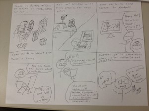
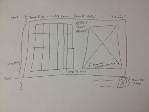
Just to know that we are on the same page as my client, I send him some storyboards, here is one of them:
The storyboard revolved around the idea that recruiters won’t take much time in a portfolio page, and that they wanted to see easily accessible work samples to see if the artists fit their need.
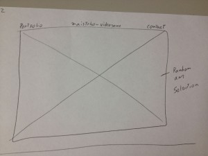
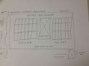
Several designs were proposed, so let’s check some of the main iterations. These are not wireframes but concepts bounded by necessary constrains, hence details like “fold” appear here to express that at least all the information presented above the fold must stay there for final specifications.
The first ones featured main sliding images with navigation menus on top or even hovering on the bottom of the image itself. Not necessarily innovative but they do a good job in letting know right the away the quality and style of the artist and fast access to a fairly straight portfolio. I tended to lean for the top menu one, to let the user know right away where they were sitting on and what they can do, nonetheless I was dissatisfied with the lack of interesting information architecture, simply many sites follow this archetypes.
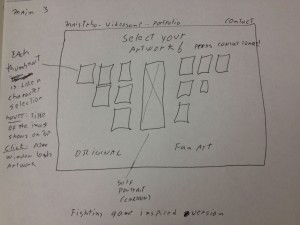
Some of the iterations produced this interesting design inspired on the character selection screen found on videogame fighting games. I thought that if I could somehow make this efficient enough I could not only give the user fast access to all the portfolio material, but be more profound in this videogame concept artist focus that was attempted to achieve with the design. Identification on top, thumbs that show each artwork with the correct affordances to click and dig in into the high resolution presentation of the material, and plus, as with fighting games, a preview of the full artwork on the right for fast non-modular checking, not just bigger thumbs, but the whole thing. Pieces where falling into the right places.
Few iterations later I decided to eliminate the separation between original artwork and fan art, since a concept artist is needed most of the time to create new characters. Still the necessary links to that kind of material will be provided.
Moving on to prototypes, I started building HTML/CSS based on Blueprint, first time I try it, already love it. Previously I used 960gs for this kind of rapid web prototype, but lately I’ve been hearing a lot about this framework and I decided to give it a try. Blueprint is basically the same concept but a bit more flexible.
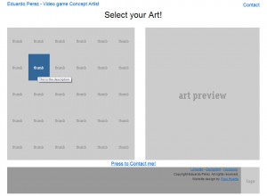
I made the thumbs change color when they are hovered to convey the appropriate interaction affordance, and when clicked a modal Ajax window will pop up with the full high resolution image. I tried a new jQuery plug-in on this project for this window called prettyPhoto and it worked pretty well so far, testing will tell if I stick to it.
The result is shown here:
The project is moving pretty quick, no we are working with the visual design and then some testing will be done for sure before putting it up.
Till then!.
From Boids to Documents – Part 2
Posted: July 20, 2012 Filed under: Human and Computer Interaction, Research | Tags: App, Boids, C++, HCI, Independent Elements, Publication, Research, Visualization, WinAPI 2 Comments »If you haven’t read Part 1 head there!.
This year we started the development on this new version of the boids program. The idea: each element is a document, and they can be grouped by similarity.
In order to create such a thing now we needed a parser module that read documents like PDF files and create a data structure that provides the similarity between each of them. That was done entirely by a partner while I was focusing in the visualization itself.
As the paper describes the idea was to create a 4th rule to the Boids Algorithm that basically will direct the element to get nearer other similar elements. There are several ways to do this and they are described on the publication. We applied that idea along a modified algorithm designed by myself that easily takes the similarity values into cohesion like behavior. The results were pretty impressive after some tweaking on the other rules.
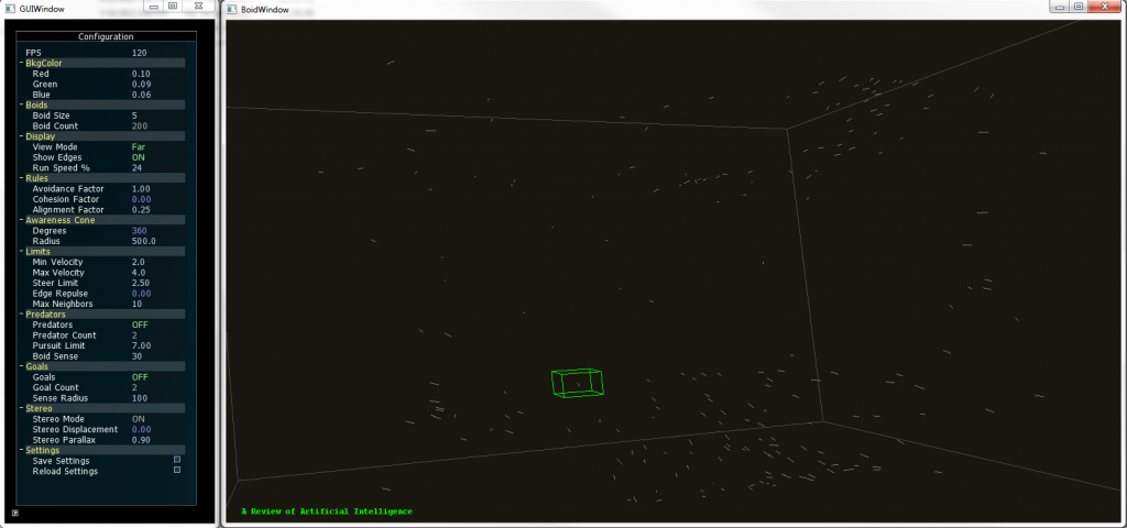
The new version supports full navigation and selection of individual elements. The title of the document can be seen while a selection is made.
To provide more insight to the user on the visualization we developed a coloring code were the user simply selects a keyword and the documents that contain that keyword would be highlighted with a user selected color. Going beyond that, the user could select an element to show the title of that particular document and even open it from that interface.
We also added freeform movement and other interactions that let the user move around the 3D space.
Boids 2.0 supports coloring of up to two keywords, so the documents that contain a particular them are highlighted, if they contain both keywords they show a mixed color. All these features can be configured by the user in real time.
In other words, we developed a whole different way to browse documents and the application served as a proof of concept for a different take on visualizing documents. And we didn’t stop there.
Tune in next time to know how we added Kinect support to the whole thing!.
From Boids to Documents – Part 1
Posted: July 19, 2012 Filed under: Human and Computer Interaction, Research | Tags: Boids, C++, HCI, Independent Elements, OpenGL, Stereoscopy, Visualization, WinAPI 2 Comments »Here’s some information on the projects as promised.
On Summer 2010 I was approached by my HCI instructor, I have already told him about my interest in the area and that I feel good to go and start working on some projects. My instructor expertise relies on Data and Scientific Visualization and he had something beign cooked at the moment. A fellow student was working in a independent agents program that visualizes several objects in a 3D space with a very dynamic behavior inspired by nature: they tend to group and navigate in this space just like flocks of birds, swarm of insects and banks of fishes do, and they can react to their environment in different ways.
This “Boids” algorithm is very popular and is used in several graphical applications like videogames and movies due to its approximation to the real behavior of these animals without necessarily simulating the way nature does, all with very simple algorithm that is not heavy computationally speaking. Being it for real time or pre rendered presentations the technique really outstanding.
Sort of like that, get the idea?
Well, I jumped into the project and did some optimization to the code and developed some interactions that were needed to further use the application in experimental setups, later we added 3D stereo to it using active shutter glasses, and let me tell you, watching thousands of elements floating out of the screen can be pretty amazing.
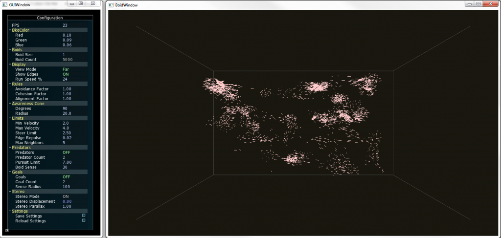
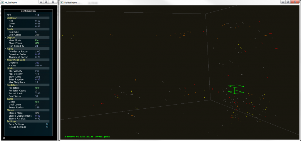
The previous picture shows about five thousand elements forming groups on 3D space. You could put other objects that can be either attract (food) or repel (predators) the boids, and you will see them reacting exactly as animals with similar behavior will do. Everything was done using C++, WinAPI and OpenGL. Project was finished and ready to go.
Fast-forward to 2012, a theoretical research was going on based on this technique: What if each element metaphorically represented a document? Well yes it would be a mess, but what if we can actually sort them out by some factor of similarity? No we are talking; we could visualize big structures of documents grouped together in clusters according to its similarity.
That’s what the newest paper is all about, and I’ll tell you how we developed a prototype in the next post.
New publications
Posted: July 9, 2012 Filed under: Human and Computer Interaction | Tags: HCI, Publication, Research, Visualization, VR 1 Comment »Next week some of the work done on my graduate research time will be published on the he 9th International Conference on Modeling, Simulation and Visualization Methods (MSV’12) and the 16th International Conference on Computer Graphics and Virtual Reality (CGVR’12). We have been hard working on some visualization techniques and some VR practices that are pretty exciting:
- Visualization and Clustering of Document Collections Using a Flock-based Swarm Intelligence Technique.
- Designing a Low Cost Immersive Environment System Twenty Years After the First CAVE.
My plan is that after the conference I’ll publish some related material on the site and the blog about the implementation of those ideas, so stay tuned for that.
Also, if you haven’t noticed, my we page is finally up. Still I have to upload more portfolio material. That will be fixed in the coming weeks.
