Designing a Web Portfolio – Part 1
Posted: August 2, 2012 Filed under: Human and Computer Interaction, User Experience, User Interface | Tags: HCI, IxD, UX, Web Leave a comment »Recently a friend of mine asked me to help him designing his online portfolio. He’s an Illustrator and he would like to project himself to the videogame industry as a concept artist.
Naturally a portfolio page is all about your work and how you share your ideas. The main audience is employers and people of the same business, or future co-workers. Is easy to discern that the main thing to be highlighted in the web page is the art work, easily accessible and presenting only the most significant items. Also, make very clear what the contact information is.
If I had the resources I would like to have some empirical data on how recruiters surf the web, but I can surely bet that their informavore behavior is: finding work samples as fast as possible to see if some of them will correspond to what their company needs at the moment.
So for starters, I did some research on some concept artist/illustrators portfolios. There are some good pieces out there, but not in terms of user centered design. Some of them featured a site built around the style of the artist, but they are not that easy to navigate. That is not an awful idea by any means if you want to produce an experience that is more akin to a journey, but we all know that is not what employers are necessary looking for, they want to see the material without any obstacles. In that sense, sites like this do a better work, and they are not very elaborate. This doesn’t mean that we can’t do anything fancy without having a hard to navigate page. There are many examples that do a wonderful work, making the art work the central piece of the design, straight to the point.
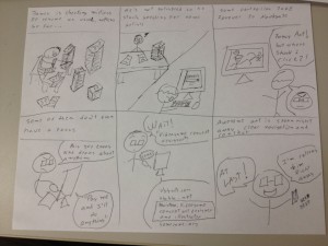
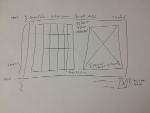
Just to know that we are on the same page as my client, I send him some storyboards, here is one of them:
The storyboard revolved around the idea that recruiters won’t take much time in a portfolio page, and that they wanted to see easily accessible work samples to see if the artists fit their need.
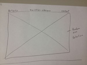
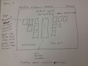
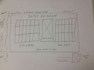
Several designs were proposed, so let’s check some of the main iterations. These are not wireframes but concepts bounded by necessary constrains, hence details like “fold” appear here to express that at least all the information presented above the fold must stay there for final specifications.
The first ones featured main sliding images with navigation menus on top or even hovering on the bottom of the image itself. Not necessarily innovative but they do a good job in letting know right the away the quality and style of the artist and fast access to a fairly straight portfolio. I tended to lean for the top menu one, to let the user know right away where they were sitting on and what they can do, nonetheless I was dissatisfied with the lack of interesting information architecture, simply many sites follow this archetypes.
Some of the iterations produced this interesting design inspired on the character selection screen found on videogame fighting games. I thought that if I could somehow make this efficient enough I could not only give the user fast access to all the portfolio material, but be more profound in this videogame concept artist focus that was attempted to achieve with the design. Identification on top, thumbs that show each artwork with the correct affordances to click and dig in into the high resolution presentation of the material, and plus, as with fighting games, a preview of the full artwork on the right for fast non-modular checking, not just bigger thumbs, but the whole thing. Pieces where falling into the right places.
Few iterations later I decided to eliminate the separation between original artwork and fan art, since a concept artist is needed most of the time to create new characters. Still the necessary links to that kind of material will be provided.
Moving on to prototypes, I started building HTML/CSS based on Blueprint, first time I try it, already love it. Previously I used 960gs for this kind of rapid web prototype, but lately I’ve been hearing a lot about this framework and I decided to give it a try. Blueprint is basically the same concept but a bit more flexible.
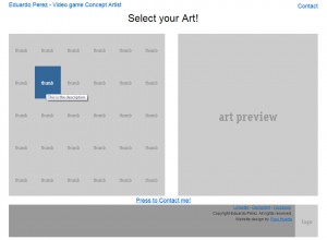
I made the thumbs change color when they are hovered to convey the appropriate interaction affordance, and when clicked a modal Ajax window will pop up with the full high resolution image. I tried a new jQuery plug-in on this project for this window called prettyPhoto and it worked pretty well so far, testing will tell if I stick to it.
The result is shown here:
The project is moving pretty quick, no we are working with the visual design and then some testing will be done for sure before putting it up.
Till then!.
