Pushing the wrong buttons
Posted: November 5, 2011 Filed under: User Experience, User Interface | Tags: Industrial Design, User Interface Leave a comment »Sometimes it’s amazing how a lot of stuff it’s made without even thinking in the people that it’s using it. I’ve seen this problem in many things, not only Computers.
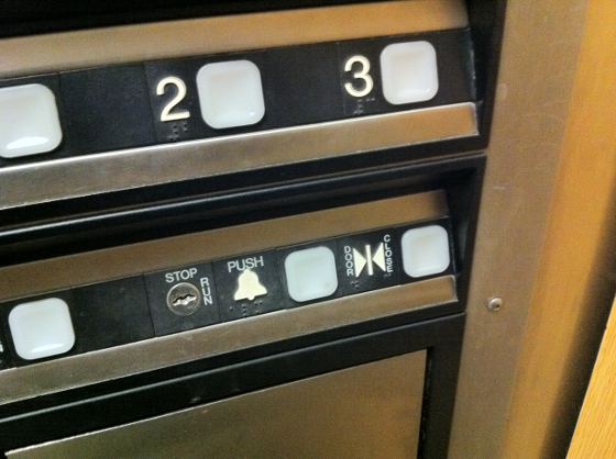
This past Friday I was using an elevator and had this interface, pretty common right?
Well there are several things that we can do to make a better panel, but let me focus on one thing here that is pretty common sense. The close button it’s there and its function is to close the door before the pre-programmed delay that the elevator doors have, usually this is used when you are in a rush and there’s no more people boarding the elevator in a way save some time. Next to it is the Alarm button, used for signaling an emergency, like if you got trapped in the elevator because of malfunctioning.
The alarm button should never be pushed if there’s no problem at all, first usually it triggers a very loud alarm that can confuse or even freak out people in the building, but it also might be an unnecessary waste the time for people in charge of the emergencies to come and check for a fake alarm. And there it is, just sitting to the side of a button that is used when you are in a rush or simply don’t want to wait, an stressful situation that increase probability of error.
How much time will pass before anyone pushes the wrong button? Not much of course.
Not only that, check the close button icon. Two arrows that can be interpreted as coming from the buttons between them, in other words, people can get confused if the arrows are just implying an action that the elevator does or they are coming from the buttons between them which may indicate their function. This will require you to use more cognition in order to get it, something we don’t usually do in a rush. What about blind people? They actually separate the Braille code in that particular icon implying that the left button might be a choice.
This could be remediated by keeping the panel consistent in its spacing, and while it does a good job by maintaining the buttons to the right of their respective label, it’s amazing how little details like this can actually create big problems in the user interface.
