Animating 2D Bubble Charts Through Time
Posted: August 9, 2012 Filed under: Human and Computer Interaction, User Interface | Tags: JavaScript, Visualization, Web Leave a comment »Information Visualization is the area that finds better way to portray data in a visual way. Several popular visualization are used in probably all disciplines in the world, since data is everywhere and need to be analyzed. As an example, in CS is very popular to see Trees and Graphs to model everything from inheritance to data structures and even software engineering.
One of the most successful examples of Information Visualization today would be bubble charts. They are very easy to understand since they are very similar mapping wise to other very common visualizations like bar and line charts, but bubbles also add an extra dimension, the size (radius) of each bubble represents a value too.
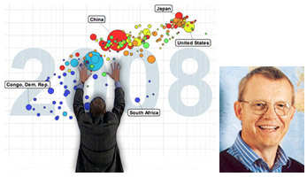
There are many good examples of bubble charts, but probably one of the most popular ones would be Hans Rosling’s Gapminder. This has been features in several documentaries and public talks throughout the world, because they really help to get a lot of insight when it comes to analyze data though time.
What it does is that it shows bubbles in a meaningful matter, and it also supports animations that let us see how all variables move around in time. The perception of time cannot be greater than watching one thing literally moving through time.
Inspired by this, the purpose of the project is to successfully emulate this chart engine, and make it accessible in different platforms.
One of the few platforms that support this kind of compatibility would be Web technology and this means HTML, CSS and JavaScript. Now, every device has access to the internet and contains a web browser compatible with most of the features present in the most recent version of these languages. The W3C does a pretty good job trying to maintain everything standardized, and while some technologies always appear challenging this standardization, the core setup remains working on every browser.
Nowadays, the web is being constantly developed by hundreds of programmers and designers. HTML5 is closer to being a standard and with it, the web becomes even more reliable and full of features, and every day that passes relies less in applets and other private extensions that compromise out of the box compatibility with less optimized execution speeds.
Research lead to a humongous number of web site featuring projects regarding visualization, from 2D to 3D, Scientific to Informational. One that got the attention of this research was MooChart. Based on MooTools, a library made for multiple purposes, mainly interactive widgets and abstraction to the most common task in a web app, this library aimed to use the rendering engine capabilities of the moo tools to draw circle using pure JavaScript, and then plot them in two axys.
This was a good opportunity for experimenting, so the library was adopted and in very few time I had the bubble chart running on a dummy web site. Now of course, this is just part of the job to successfully create an animated time bounded bubble chart that was the needed to create the time dimension on the chart. Depending on how time was manipulated, the position of the bubble will be updated.
Each point of the bubbles in the chart was recorded in X and Y coordinates as well as the radius. The data structure used for this also allowed multiple values of this kind of data, storing each position through time. The identifier that will enumerate each moment though time was bounded to an slider, one of the best widgets for mapping time. It’s very intuitive to use: simply drag the slider to the right and time advances, drag it to the left and time moves backwards. If the slider was updated with a position, the chart was redrawn to show any change. On this implementation, change on the chart happens when the slider has a time value that is present on the data structure.
After making this work, the chart was ready to be used, but still we are not close to Roseling’s approach. When the chart was used it was still lacking a very fundamental feature that was not only really insightful and novel, but pretty impressive: the animation.
In Digital graphics Animation is done by calculating the frames when an object should be in time depending information like physics, or in this case, data behavior. The animation can’t be perfect all the time; we simply don’t have that many data samples for every millisecond of animation, and we never will. If the animation was played on the current implementation explained so far, it would be very jumpy, non dramatic and non intuitive by the lack of perceptual information, rendering it meaningless. Hence the creation of a data approximation function; the implementation needed a way to create the frames that were missing, or in other words, the points between one moment in time to the other.
Knowing that the approach taken was the creation of a recursive timer that by calculating the slope of a line between one point to the other would be able to sample the points for each movement. The timer would be able to repeat this action in an incrementally, but not going as fast as possible like a regular loop would, but in a timely, adjustable and perceivable fashion.
Since the animation will run through several points, the timer itself will end when the goal was reached and in a recursive way will call another timer function that samples the way in the following period of time, this until the last value of the chart was reached.
Linking this function to a button press even, the user of the visualization is able to click and start the animation from anywhere in time on the chart context. The user can also pause the animation. This is done by telling the function to not increase to the next sample point and simply stay in the current one until the user resumes the animation letting the movement across the sampling continue, or simply stop the animation altogether.
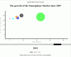
You can try the complete prototype which is preloaded with data from the mobile OS market share in time context. This version basically accomplishes everything I setup for the project. As expected, this visualization runs in a several devices and so far it has been tested in PCs, iPhones and iPads without problems.
In the future, more development can be added to the system by making the animation more resource efficient, and also be bounded to real time, i.e. frame skipping algorithm, so it runs at the same speed in every system. This, and a bit of code clean up could be potentially released as a plugging to MooChart project, making it available to anyone that wants to use it.
Designing a Web Portfolio – Part 1
Posted: August 2, 2012 Filed under: Human and Computer Interaction, User Experience, User Interface | Tags: HCI, IxD, UX, Web Leave a comment »Recently a friend of mine asked me to help him designing his online portfolio. He’s an Illustrator and he would like to project himself to the videogame industry as a concept artist.
Naturally a portfolio page is all about your work and how you share your ideas. The main audience is employers and people of the same business, or future co-workers. Is easy to discern that the main thing to be highlighted in the web page is the art work, easily accessible and presenting only the most significant items. Also, make very clear what the contact information is.
If I had the resources I would like to have some empirical data on how recruiters surf the web, but I can surely bet that their informavore behavior is: finding work samples as fast as possible to see if some of them will correspond to what their company needs at the moment.
So for starters, I did some research on some concept artist/illustrators portfolios. There are some good pieces out there, but not in terms of user centered design. Some of them featured a site built around the style of the artist, but they are not that easy to navigate. That is not an awful idea by any means if you want to produce an experience that is more akin to a journey, but we all know that is not what employers are necessary looking for, they want to see the material without any obstacles. In that sense, sites like this do a better work, and they are not very elaborate. This doesn’t mean that we can’t do anything fancy without having a hard to navigate page. There are many examples that do a wonderful work, making the art work the central piece of the design, straight to the point.
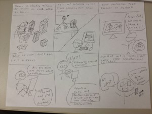
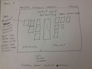
Just to know that we are on the same page as my client, I send him some storyboards, here is one of them:
The storyboard revolved around the idea that recruiters won’t take much time in a portfolio page, and that they wanted to see easily accessible work samples to see if the artists fit their need.
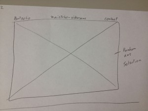
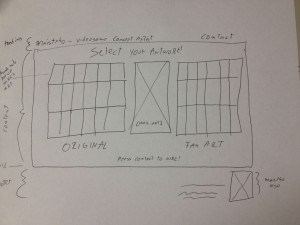
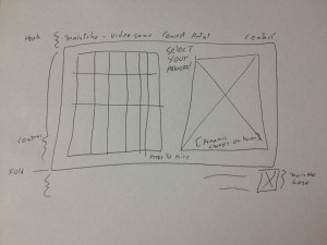
Several designs were proposed, so let’s check some of the main iterations. These are not wireframes but concepts bounded by necessary constrains, hence details like “fold” appear here to express that at least all the information presented above the fold must stay there for final specifications.
The first ones featured main sliding images with navigation menus on top or even hovering on the bottom of the image itself. Not necessarily innovative but they do a good job in letting know right the away the quality and style of the artist and fast access to a fairly straight portfolio. I tended to lean for the top menu one, to let the user know right away where they were sitting on and what they can do, nonetheless I was dissatisfied with the lack of interesting information architecture, simply many sites follow this archetypes.
Some of the iterations produced this interesting design inspired on the character selection screen found on videogame fighting games. I thought that if I could somehow make this efficient enough I could not only give the user fast access to all the portfolio material, but be more profound in this videogame concept artist focus that was attempted to achieve with the design. Identification on top, thumbs that show each artwork with the correct affordances to click and dig in into the high resolution presentation of the material, and plus, as with fighting games, a preview of the full artwork on the right for fast non-modular checking, not just bigger thumbs, but the whole thing. Pieces where falling into the right places.
Few iterations later I decided to eliminate the separation between original artwork and fan art, since a concept artist is needed most of the time to create new characters. Still the necessary links to that kind of material will be provided.
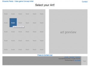
Moving on to prototypes, I started building HTML/CSS based on Blueprint, first time I try it, already love it. Previously I used 960gs for this kind of rapid web prototype, but lately I’ve been hearing a lot about this framework and I decided to give it a try. Blueprint is basically the same concept but a bit more flexible.
I made the thumbs change color when they are hovered to convey the appropriate interaction affordance, and when clicked a modal Ajax window will pop up with the full high resolution image. I tried a new jQuery plug-in on this project for this window called prettyPhoto and it worked pretty well so far, testing will tell if I stick to it.
The result is shown here:
The project is moving pretty quick, no we are working with the visual design and then some testing will be done for sure before putting it up.
Till then!.
From Boids to Documents – Part 2
Posted: July 20, 2012 Filed under: Human and Computer Interaction, Research | Tags: App, Boids, C++, HCI, Independent Elements, Publication, Research, Visualization, WinAPI 2 Comments »If you haven’t read Part 1 head there!.
This year we started the development on this new version of the boids program. The idea: each element is a document, and they can be grouped by similarity.
In order to create such a thing now we needed a parser module that read documents like PDF files and create a data structure that provides the similarity between each of them. That was done entirely by a partner while I was focusing in the visualization itself.
As the paper describes the idea was to create a 4th rule to the Boids Algorithm that basically will direct the element to get nearer other similar elements. There are several ways to do this and they are described on the publication. We applied that idea along a modified algorithm designed by myself that easily takes the similarity values into cohesion like behavior. The results were pretty impressive after some tweaking on the other rules.
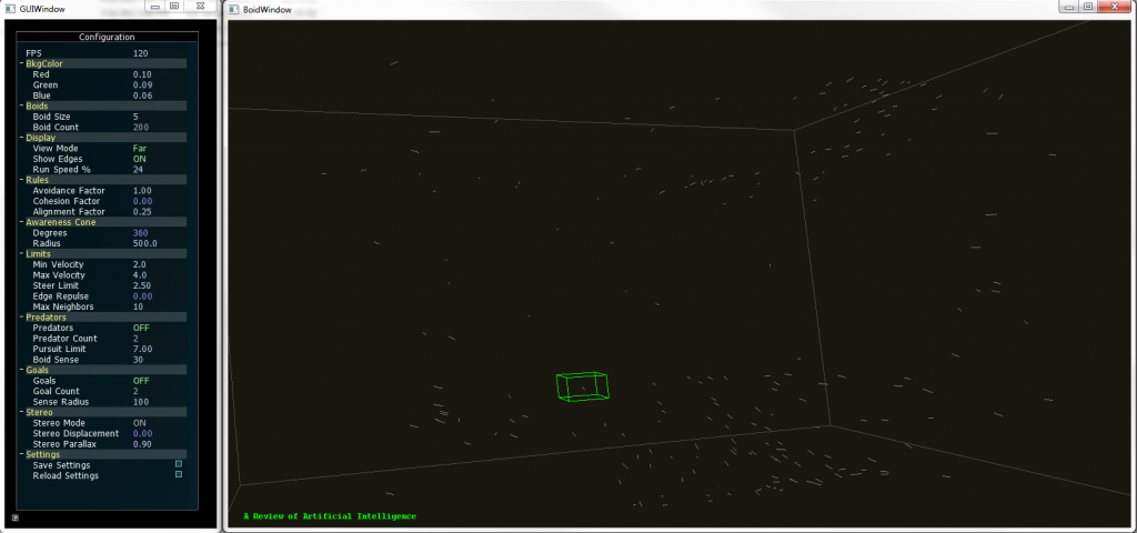
The new version supports full navigation and selection of individual elements. The title of the document can be seen while a selection is made.
To provide more insight to the user on the visualization we developed a coloring code were the user simply selects a keyword and the documents that contain that keyword would be highlighted with a user selected color. Going beyond that, the user could select an element to show the title of that particular document and even open it from that interface.
We also added freeform movement and other interactions that let the user move around the 3D space.
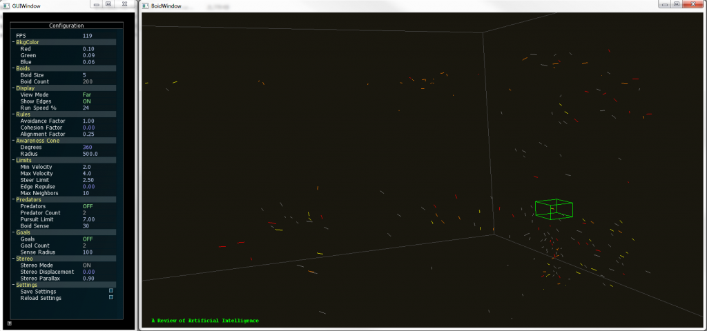
Boids 2.0 supports coloring of up to two keywords, so the documents that contain a particular them are highlighted, if they contain both keywords they show a mixed color. All these features can be configured by the user in real time.
In other words, we developed a whole different way to browse documents and the application served as a proof of concept for a different take on visualizing documents. And we didn’t stop there.
Tune in next time to know how we added Kinect support to the whole thing!.
From Boids to Documents – Part 1
Posted: July 19, 2012 Filed under: Human and Computer Interaction, Research | Tags: Boids, C++, HCI, Independent Elements, OpenGL, Stereoscopy, Visualization, WinAPI 2 Comments »Here’s some information on the projects as promised.
On Summer 2010 I was approached by my HCI instructor, I have already told him about my interest in the area and that I feel good to go and start working on some projects. My instructor expertise relies on Data and Scientific Visualization and he had something beign cooked at the moment. A fellow student was working in a independent agents program that visualizes several objects in a 3D space with a very dynamic behavior inspired by nature: they tend to group and navigate in this space just like flocks of birds, swarm of insects and banks of fishes do, and they can react to their environment in different ways.
This “Boids” algorithm is very popular and is used in several graphical applications like videogames and movies due to its approximation to the real behavior of these animals without necessarily simulating the way nature does, all with very simple algorithm that is not heavy computationally speaking. Being it for real time or pre rendered presentations the technique really outstanding.
Sort of like that, get the idea?
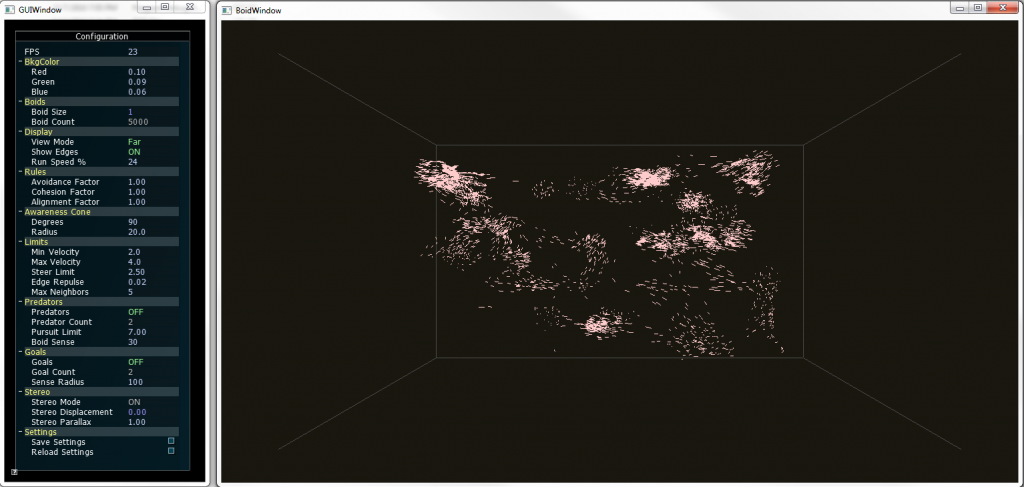
Well, I jumped into the project and did some optimization to the code and developed some interactions that were needed to further use the application in experimental setups, later we added 3D stereo to it using active shutter glasses, and let me tell you, watching thousands of elements floating out of the screen can be pretty amazing.
The previous picture shows about five thousand elements forming groups on 3D space. You could put other objects that can be either attract (food) or repel (predators) the boids, and you will see them reacting exactly as animals with similar behavior will do. Everything was done using C++, WinAPI and OpenGL. Project was finished and ready to go.
Fast-forward to 2012, a theoretical research was going on based on this technique: What if each element metaphorically represented a document? Well yes it would be a mess, but what if we can actually sort them out by some factor of similarity? No we are talking; we could visualize big structures of documents grouped together in clusters according to its similarity.
That’s what the newest paper is all about, and I’ll tell you how we developed a prototype in the next post.
New publications
Posted: July 9, 2012 Filed under: Human and Computer Interaction | Tags: HCI, Publication, Research, Visualization, VR 1 Comment »Next week some of the work done on my graduate research time will be published on the he 9th International Conference on Modeling, Simulation and Visualization Methods (MSV’12) and the 16th International Conference on Computer Graphics and Virtual Reality (CGVR’12). We have been hard working on some visualization techniques and some VR practices that are pretty exciting:
- Visualization and Clustering of Document Collections Using a Flock-based Swarm Intelligence Technique.
- Designing a Low Cost Immersive Environment System Twenty Years After the First CAVE.
My plan is that after the conference I’ll publish some related material on the site and the blog about the implementation of those ideas, so stay tuned for that.
Also, if you haven’t noticed, my we page is finally up. Still I have to upload more portfolio material. That will be fixed in the coming weeks.
Not quite what you expected – Condition ONE
Posted: January 5, 2012 Filed under: Human and Computer Interaction, User Experience | Tags: App, Immersion, iPad, Not quite what you expected 1 Comment »It’s extremely surprising how in this industry we find innovation almost daily. Anyone that tries to stay updated with everything that happens will tell you how hard it is to do it. But in the end there are a lot of solutions that are based in an idea that on its implementation it’s not quite what the concept was aiming for.
Most of ideas will begin in something like “wouldn’t it be cool if we do this” and then from it derivate to something more specific and possible, something like “wouldn’t it be cool if do this for this line of users on this age range, with this particular need and this certain times of the day”. And yes, they seem well structured, and the evaluation for the technology needed seems to be a good fit. But in the interactive world particularly the evaluation or development of the technology needed or the content itself fails often and products are rushed to the market as good ideas but poor execution.
Recently I was checking on the Condition ONE app on the App Store. It’s an app that basically immerses you in different scenes where different things happen, mostly documentaries about certain events, reports, etc. The way this works is that the app plays a video that is interactive in a way that you can move the device anywhere and basically change the perspective of the camera. Having the 360 degree power to look at the surroundings of the happenings, trying to emulate the feeling of being there.
Take a look at the video below and you will get a good representation on how the offering works:
Condition ONE Demo from Danfung Dennis on Vimeo.
Awesome right?, not quite. I was thrilled to try it but I was already expecting some hiccups on the road. The thing is most of this type of application rely on accelerometers or gyroscopes (or both) that checks constantly for the position of the device. Most of portable products nowadays use it perfectly for detecting screen orientation and it works alright. Some even use compass features and sometimes the sensors are that reliable that you can some pretty precise work. Also we have seen it countless times on pedometer apps and games.
Now if you want to use this for something like controlling a perspective it might not be perfect. To begin with you need a reference or a point to be the horizon, and then form there on move the perspective. Some Wii games, for example, will suggest you to point to the center of the screen before interacting with the camera or simple tell you to point to the center and recalibrate the camera with a button. This app does that with a button called center. I know what it does, but not any common user that used the app.
After that it gets really annoying is not well made for the experience. You don’t have control over focus or depths so some scenes are way too close to look properly at something interesting and you end up missing the whole point. Also it was filmed with shaking hands and that creates a lot of disorientation if your device is not moving at all or doesn’t feel like is responding properly. This is very important if the Condition ONE team attempts to create immersion because this particulars problems make the user seems like it doesn’t have the control over its actions.
But this is not an entirely a bad thing because from mistakes there’s learning and from learning there’s success. This errors can be fixed to adapt to the technology present on the iPad easily with a fixed design and a 1.5 release of this app that could be usable and not just something to toy with a couple of minutes and then not ever launch it again. The calibrating issue is workable by teaching the user how to use the app, and the video issue could be tweaked to be more stable and well thought. Some more controlled documentaries could help to experiment a little better with this before going to the field. Also, make it really worthwhile to see the whole spectrum of the scene, and when you focus on something give cues to the user so it redirects its attention there.
Condition ONE team, you’ve got something pretty cool here, don’t drop it, polish it and make it shine!. Also, this would be so cool in a CAVE like environment!.
Cell phones + Kinect = Good idea?
Posted: November 1, 2011 Filed under: Human and Computer Interaction, User Experience, User Interface | Tags: Concept, iPhone, Kinect, Motion Sensing, Natural User Interface, Smartphone, User Interface 2 Comments »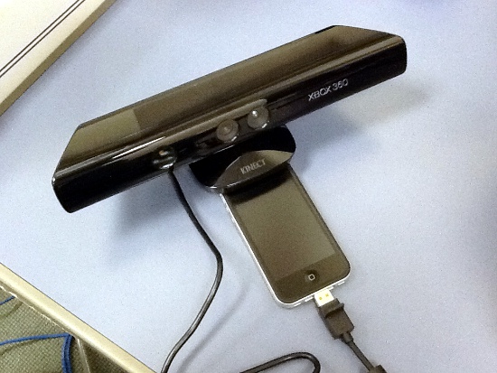
So yesterday I found a video about how technology like “Kinect” is reaching the cell phone market. Pantech is realizing a phone with this technology in Korea around November. Video of the commercial below:
First impression, pretty neat. Now let’s disassemble this idea.
In a practical sense there’s some stuff that are not being apparent here. When some it’s calling you could pick up a call easily by using a gesture as the ad shows, but when you are the one that wants to initiate a call it won’t work. Cell phones usually will turn off all their sensors when they are locked to save battery, there’s simply no way to keep the camera on for every time we want to perform a task with our phones, and as I said, this won’t be a problem for picking up a call since the phone it’s already awake when it rings, but when it’s locked or sleeping the phone is not listening to you all the time. Think of it as if you could use Siri in the iPhone 4S without touching the button.
But there’s definitive practical use for this, and might add it’s really a cool idea to add this functionality. Although have a camera that actively checking for hand gestures might be a real battery drain, there might be a way to build a decent camera that performs well the task without killing your battery every time you are using your phone.
My main problem with the video it’s the lack of vision and innovation. By reproducing gestures that already work well with touch you are just creating a gimmick, a device that it’s just for show off and adds very little to none to its purpose. Swiping photos by hovering your hand across the device doesn’t make it better, it’s just cooler, a factor that wears off in a week or less, and can actually get the user angry when the battery life will be inevitably shorter, they either introduce an great advancement in energy management or the phone will be pretty bulky.
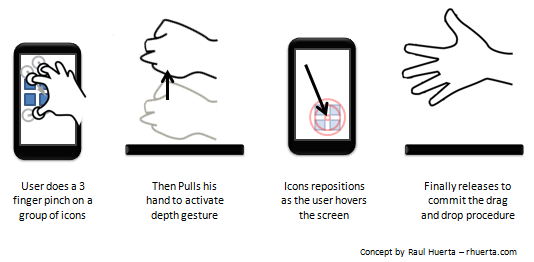
Still the idea it’s awesome, but it must be justified with great implementations, like upgrading current touching gestures or by creating useful gestures that can’t be done with current touch devices. A nice example will be to use a depth sensor to check how close or far the hand it’s from the device and make the GUI react to it as a function of those changes. For drag and dropping this could be perfect, imagine you could pinch into several objects to group them, then raise your hand, scroll around the GUI and the drop them whenever you like. This kind of example could be really uncomfortable to do on an “only touch” based device and a visual recognition approach could be useful.
That was just one example on what you could do with this kind of devices. Another would be to replace a lot of the 3D gestures that usually needs of an anchor, in other words, the use of two hands.
Of course, such a device would have to be planned well in all levels to achieve an integral solution, but I think feasible to create as a mass product in the near future. It’s a good idea but I don’t think the product shown in the ad will popularize it.
