Animating 2D Bubble Charts Through Time
Posted: August 9, 2012 Filed under: Human and Computer Interaction, User Interface | Tags: JavaScript, Visualization, Web Leave a comment »Information Visualization is the area that finds better way to portray data in a visual way. Several popular visualization are used in probably all disciplines in the world, since data is everywhere and need to be analyzed. As an example, in CS is very popular to see Trees and Graphs to model everything from inheritance to data structures and even software engineering.
One of the most successful examples of Information Visualization today would be bubble charts. They are very easy to understand since they are very similar mapping wise to other very common visualizations like bar and line charts, but bubbles also add an extra dimension, the size (radius) of each bubble represents a value too.
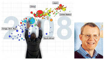
There are many good examples of bubble charts, but probably one of the most popular ones would be Hans Rosling’s Gapminder. This has been features in several documentaries and public talks throughout the world, because they really help to get a lot of insight when it comes to analyze data though time.
What it does is that it shows bubbles in a meaningful matter, and it also supports animations that let us see how all variables move around in time. The perception of time cannot be greater than watching one thing literally moving through time.
Inspired by this, the purpose of the project is to successfully emulate this chart engine, and make it accessible in different platforms.
One of the few platforms that support this kind of compatibility would be Web technology and this means HTML, CSS and JavaScript. Now, every device has access to the internet and contains a web browser compatible with most of the features present in the most recent version of these languages. The W3C does a pretty good job trying to maintain everything standardized, and while some technologies always appear challenging this standardization, the core setup remains working on every browser.
Nowadays, the web is being constantly developed by hundreds of programmers and designers. HTML5 is closer to being a standard and with it, the web becomes even more reliable and full of features, and every day that passes relies less in applets and other private extensions that compromise out of the box compatibility with less optimized execution speeds.
Research lead to a humongous number of web site featuring projects regarding visualization, from 2D to 3D, Scientific to Informational. One that got the attention of this research was MooChart. Based on MooTools, a library made for multiple purposes, mainly interactive widgets and abstraction to the most common task in a web app, this library aimed to use the rendering engine capabilities of the moo tools to draw circle using pure JavaScript, and then plot them in two axys.
This was a good opportunity for experimenting, so the library was adopted and in very few time I had the bubble chart running on a dummy web site. Now of course, this is just part of the job to successfully create an animated time bounded bubble chart that was the needed to create the time dimension on the chart. Depending on how time was manipulated, the position of the bubble will be updated.
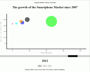
Each point of the bubbles in the chart was recorded in X and Y coordinates as well as the radius. The data structure used for this also allowed multiple values of this kind of data, storing each position through time. The identifier that will enumerate each moment though time was bounded to an slider, one of the best widgets for mapping time. It’s very intuitive to use: simply drag the slider to the right and time advances, drag it to the left and time moves backwards. If the slider was updated with a position, the chart was redrawn to show any change. On this implementation, change on the chart happens when the slider has a time value that is present on the data structure.
After making this work, the chart was ready to be used, but still we are not close to Roseling’s approach. When the chart was used it was still lacking a very fundamental feature that was not only really insightful and novel, but pretty impressive: the animation.
In Digital graphics Animation is done by calculating the frames when an object should be in time depending information like physics, or in this case, data behavior. The animation can’t be perfect all the time; we simply don’t have that many data samples for every millisecond of animation, and we never will. If the animation was played on the current implementation explained so far, it would be very jumpy, non dramatic and non intuitive by the lack of perceptual information, rendering it meaningless. Hence the creation of a data approximation function; the implementation needed a way to create the frames that were missing, or in other words, the points between one moment in time to the other.
Knowing that the approach taken was the creation of a recursive timer that by calculating the slope of a line between one point to the other would be able to sample the points for each movement. The timer would be able to repeat this action in an incrementally, but not going as fast as possible like a regular loop would, but in a timely, adjustable and perceivable fashion.
Since the animation will run through several points, the timer itself will end when the goal was reached and in a recursive way will call another timer function that samples the way in the following period of time, this until the last value of the chart was reached.
Linking this function to a button press even, the user of the visualization is able to click and start the animation from anywhere in time on the chart context. The user can also pause the animation. This is done by telling the function to not increase to the next sample point and simply stay in the current one until the user resumes the animation letting the movement across the sampling continue, or simply stop the animation altogether.
You can try the complete prototype which is preloaded with data from the mobile OS market share in time context. This version basically accomplishes everything I setup for the project. As expected, this visualization runs in a several devices and so far it has been tested in PCs, iPhones and iPads without problems.
In the future, more development can be added to the system by making the animation more resource efficient, and also be bounded to real time, i.e. frame skipping algorithm, so it runs at the same speed in every system. This, and a bit of code clean up could be potentially released as a plugging to MooChart project, making it available to anyone that wants to use it.

